- The Oregon Catalyst -
https://oregoncatalyst.com
-
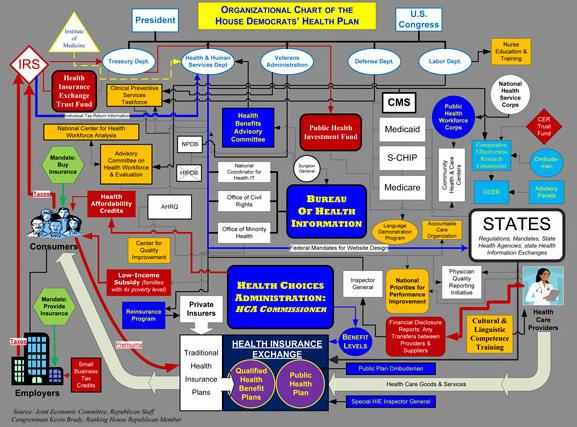
The Famous Obama Health Care Chart: What it really looks like
Posted By
In the news
On
July 28, 2009 @ 7:04 am
In Measure 37 |
No Comments
See also
Here for a bigger picture
[1]
Share
[2]
[3]
[4]
[5]
[6]
Related posts:
Myth of Objectivity Part II
[7]
LIVE ISSUE RESULTS!!! – Issue Four – Universal Health Coverage
[8]
Pulling the Welcome Mat on Obama
[9]
President Obama, Why, Sir, Why?
[10]